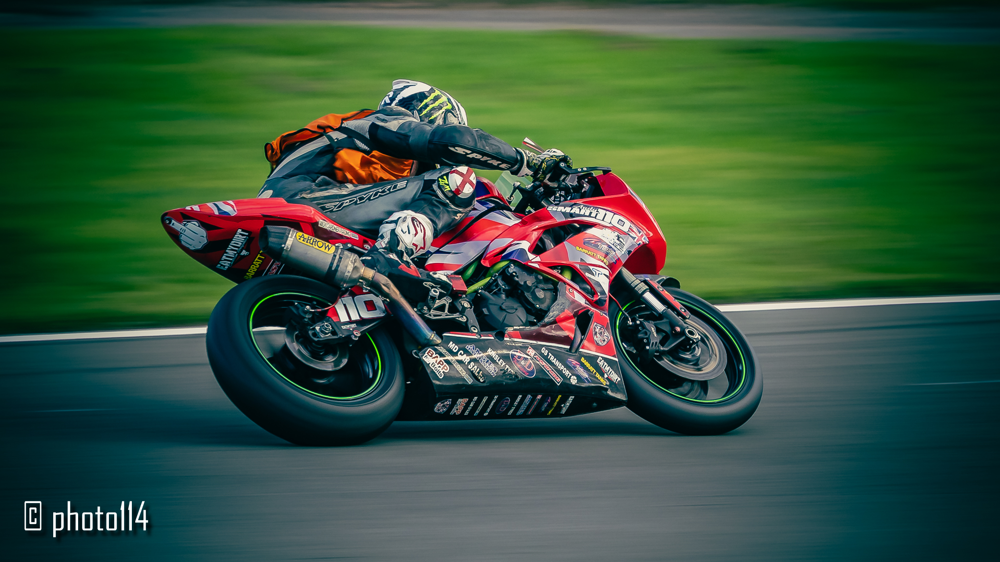
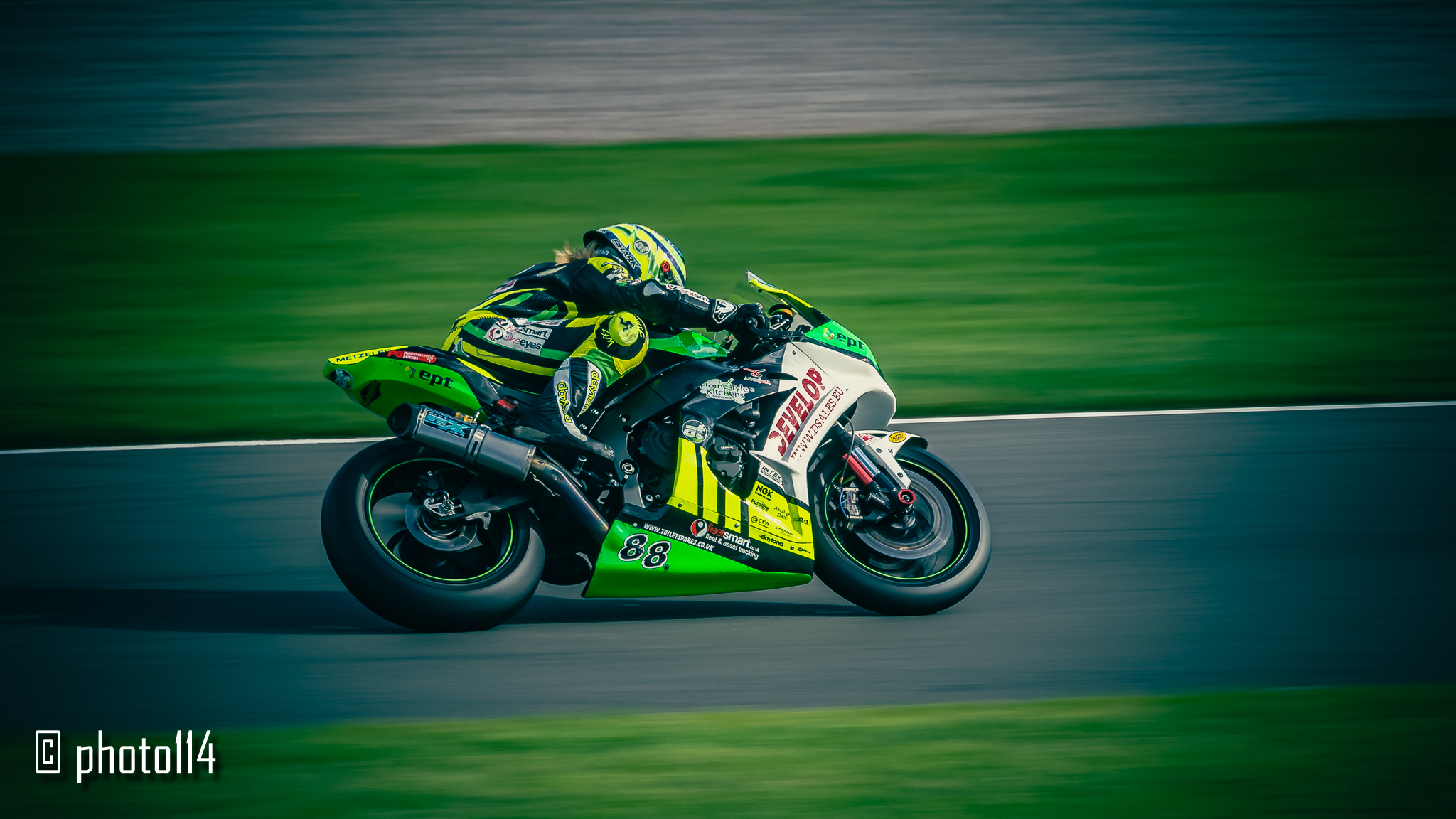
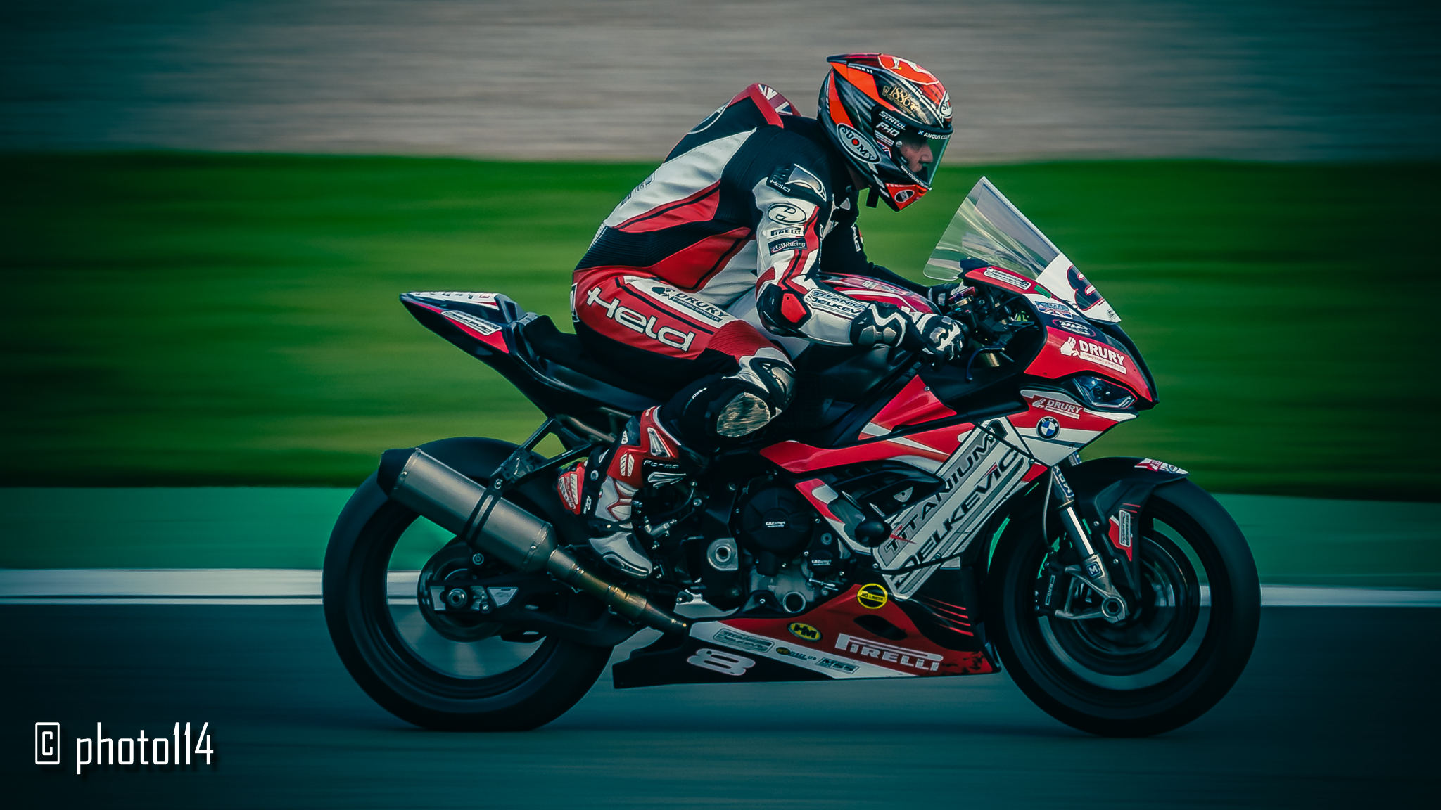
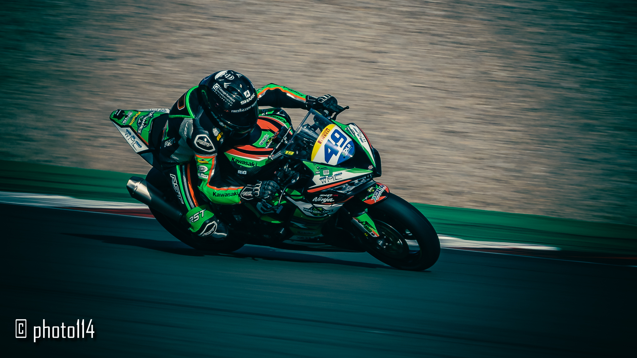
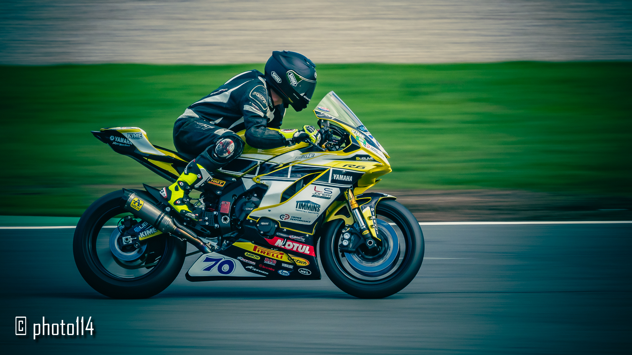
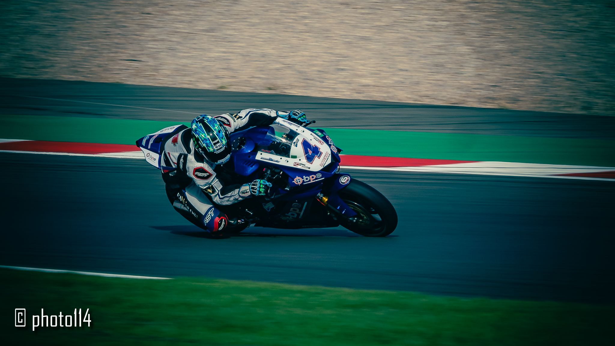
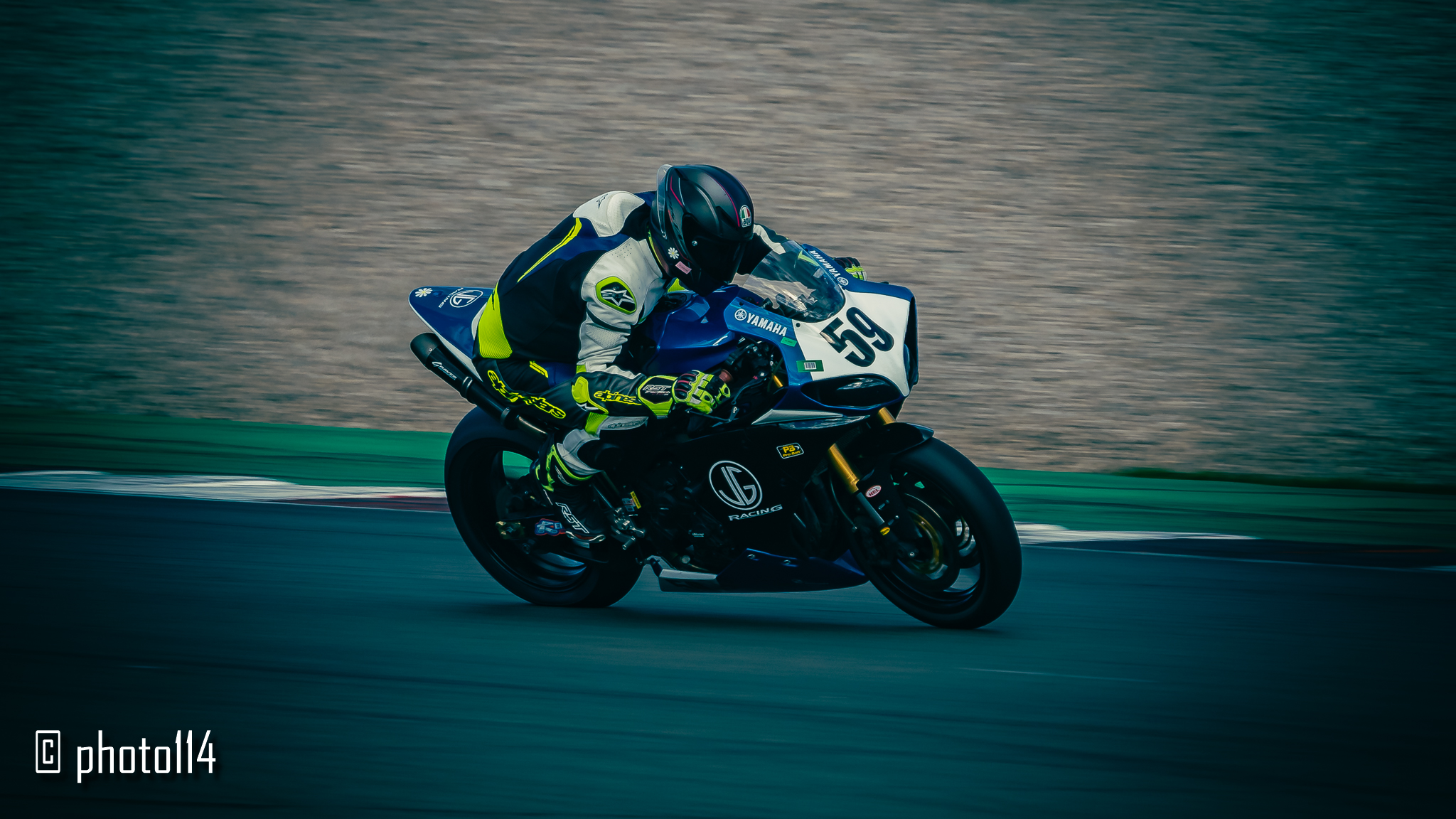
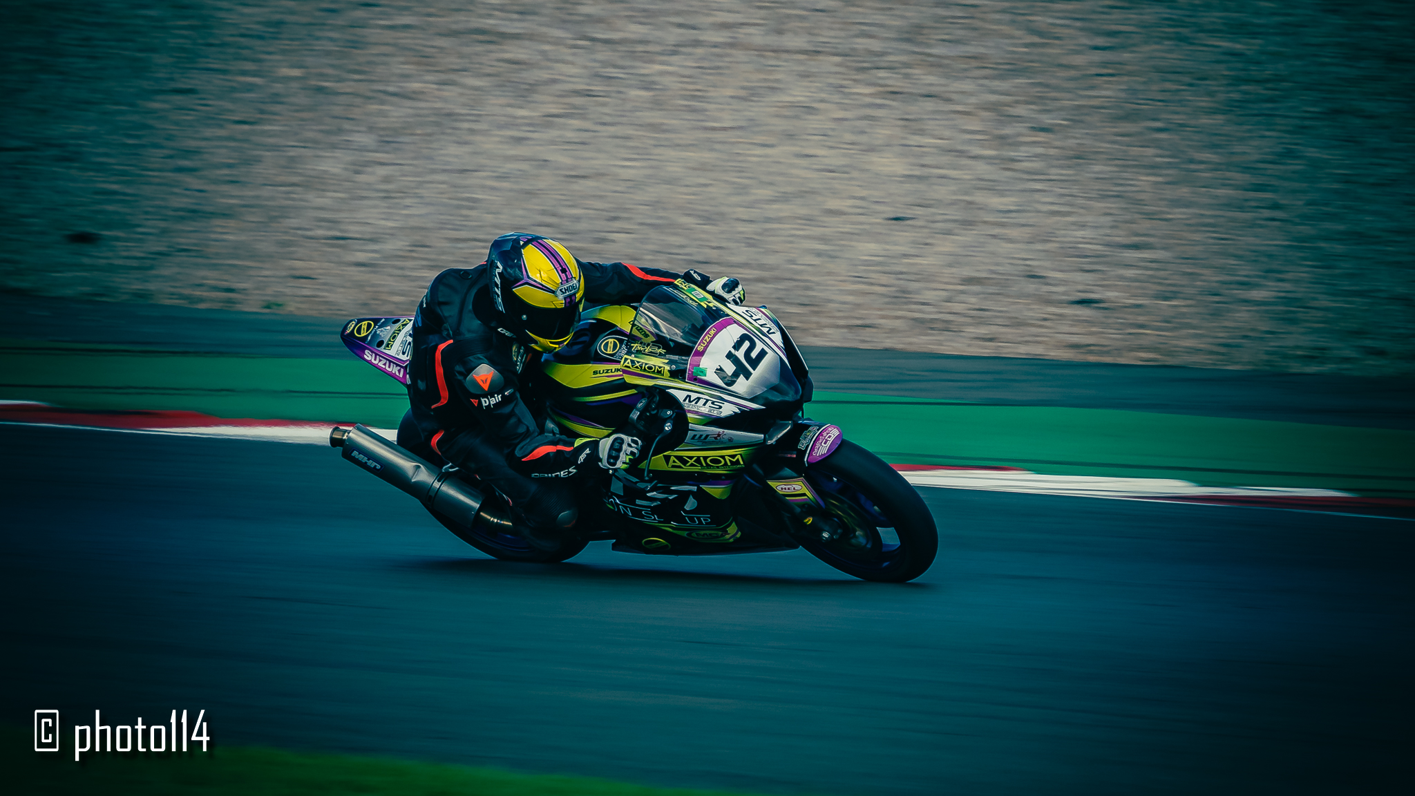
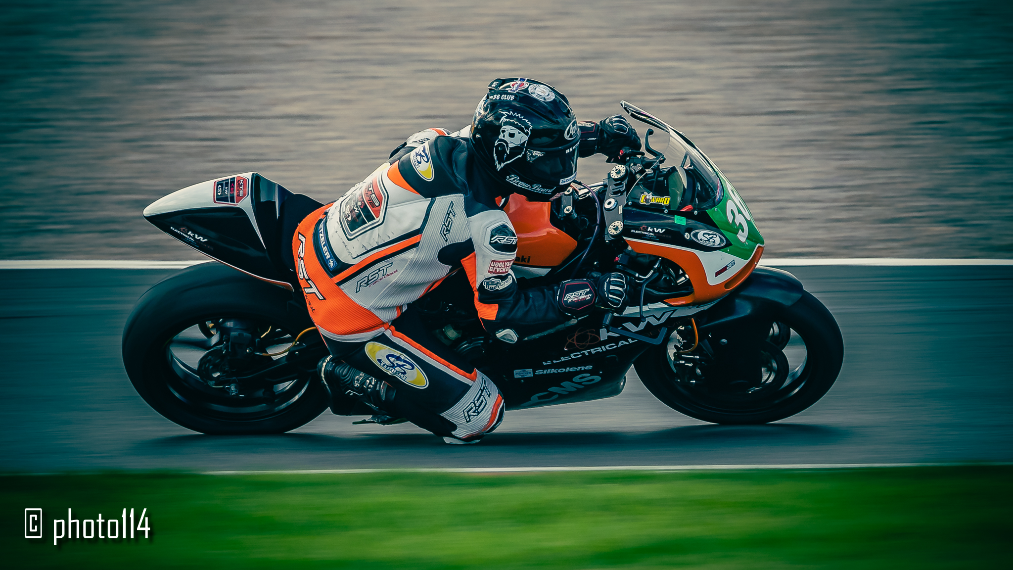
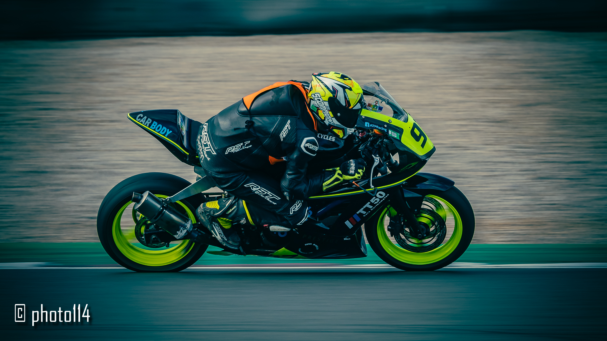
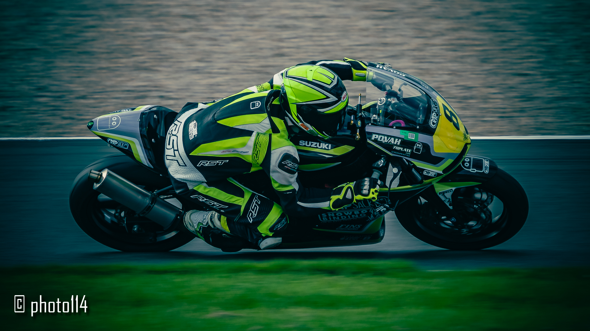
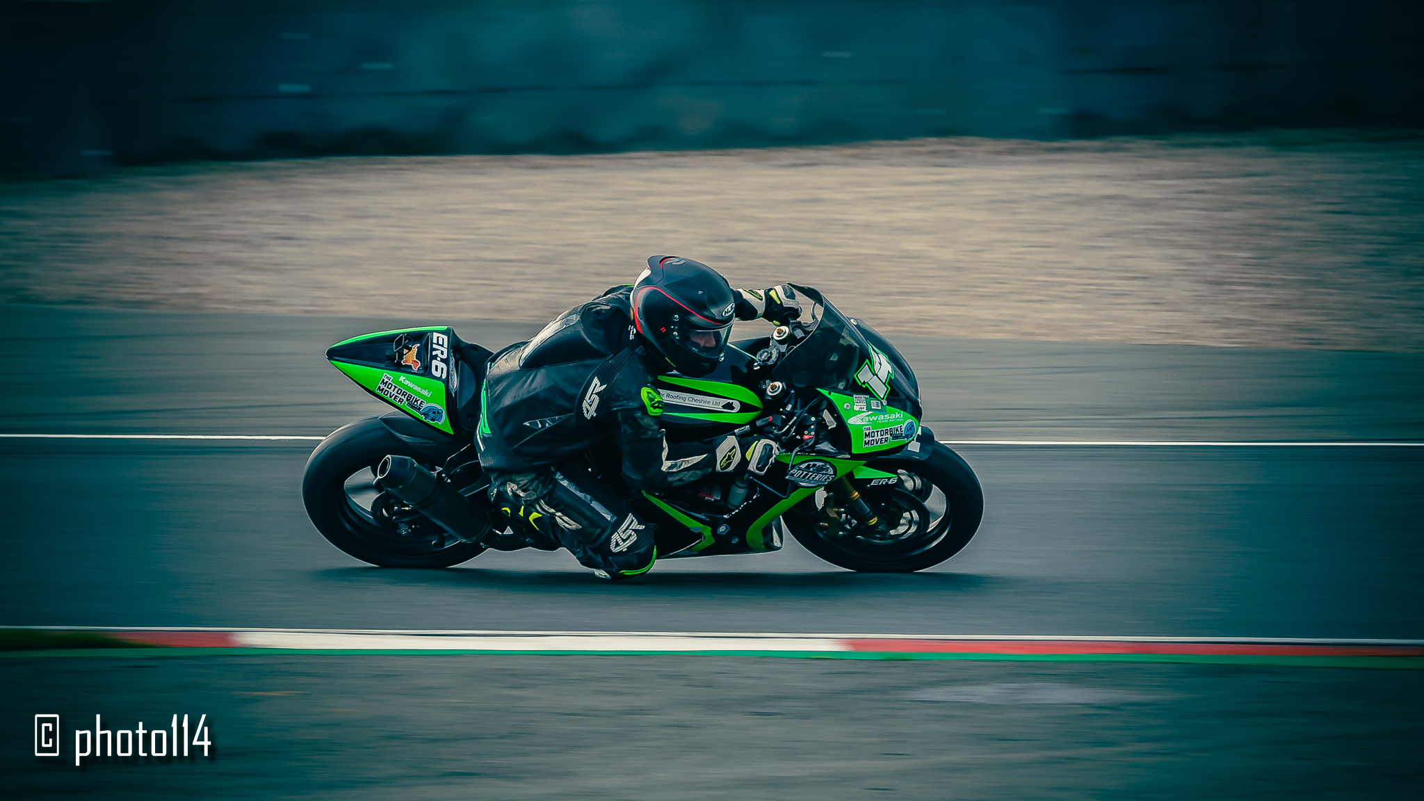
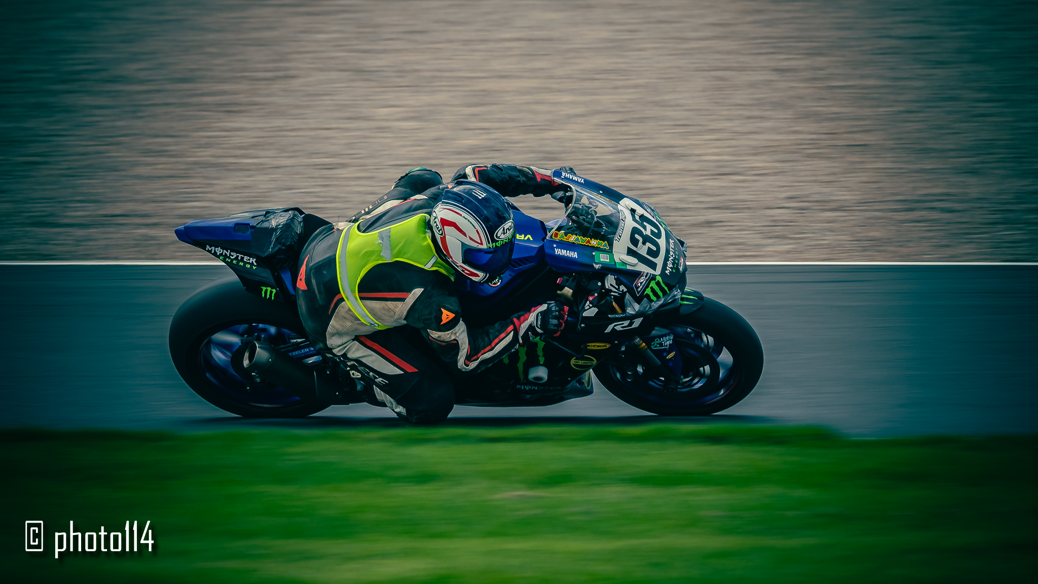
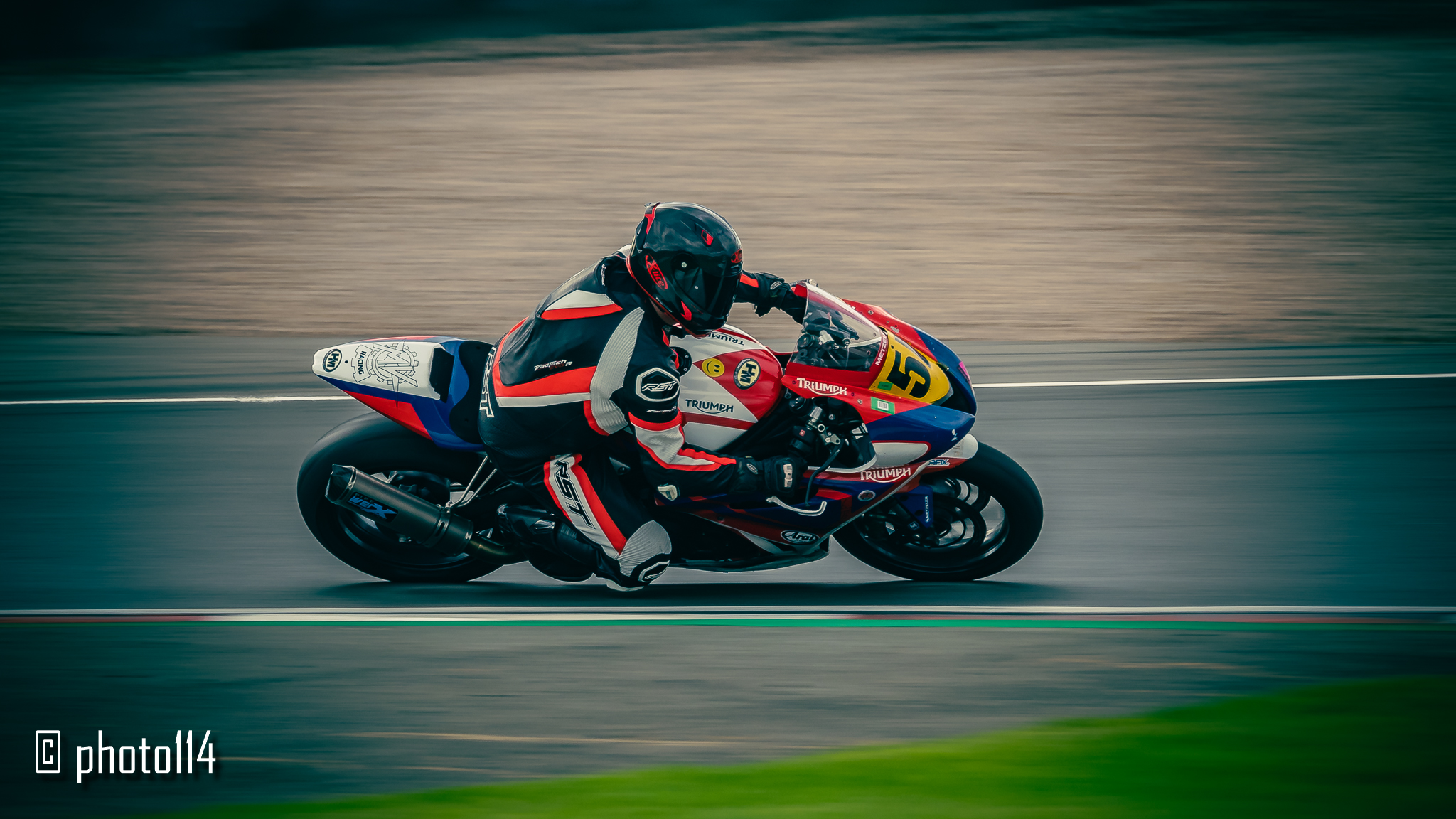
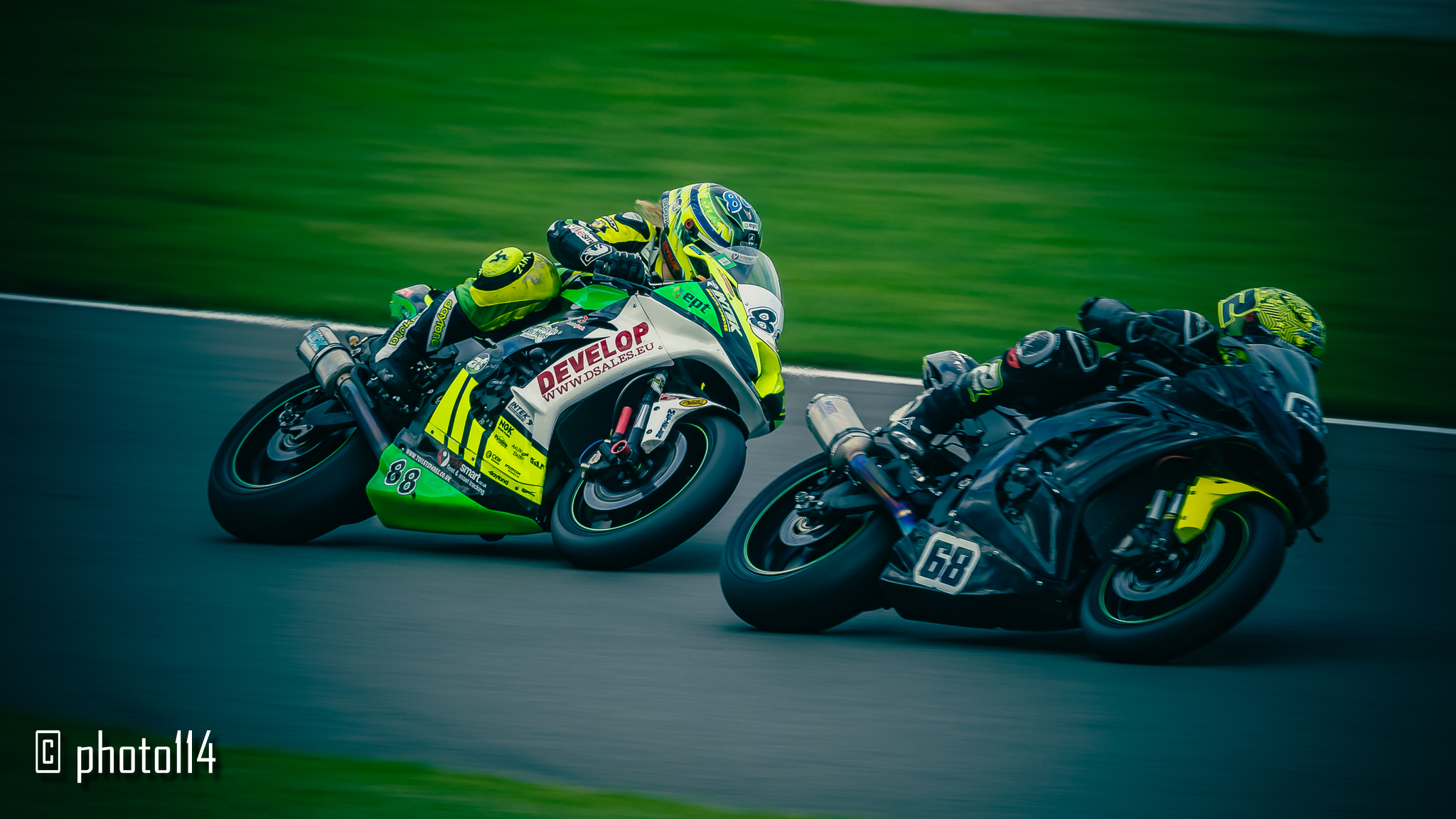
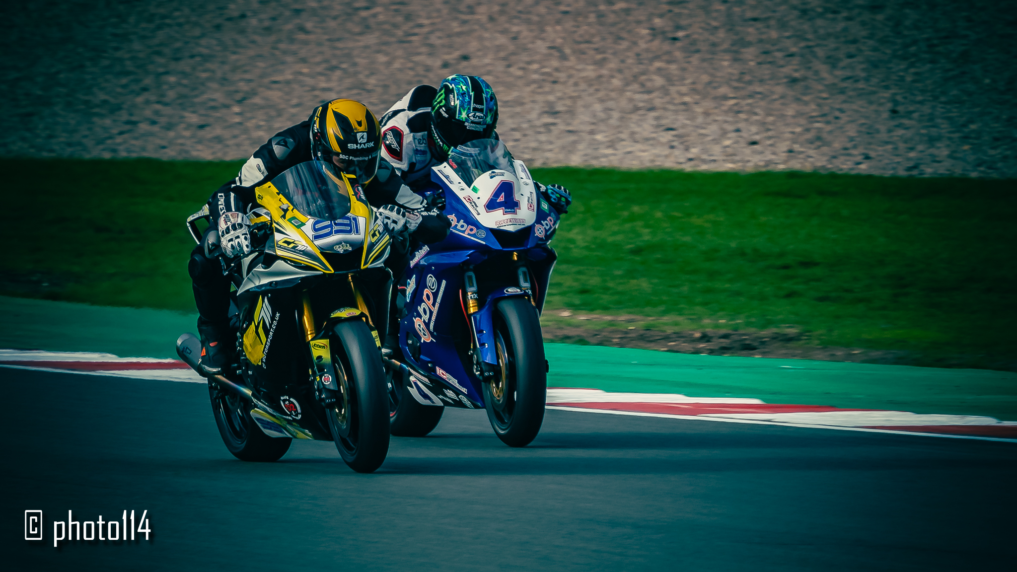
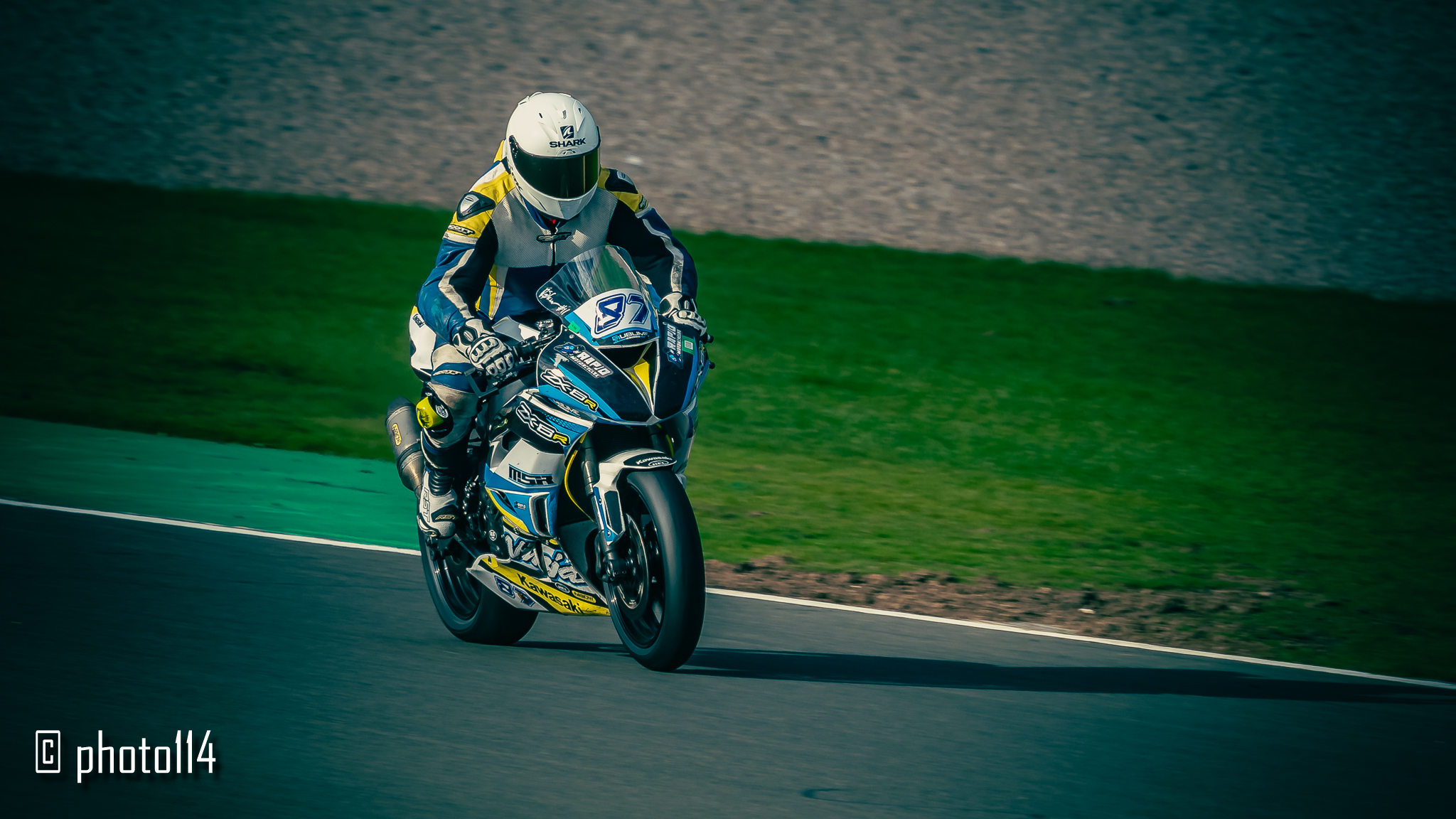
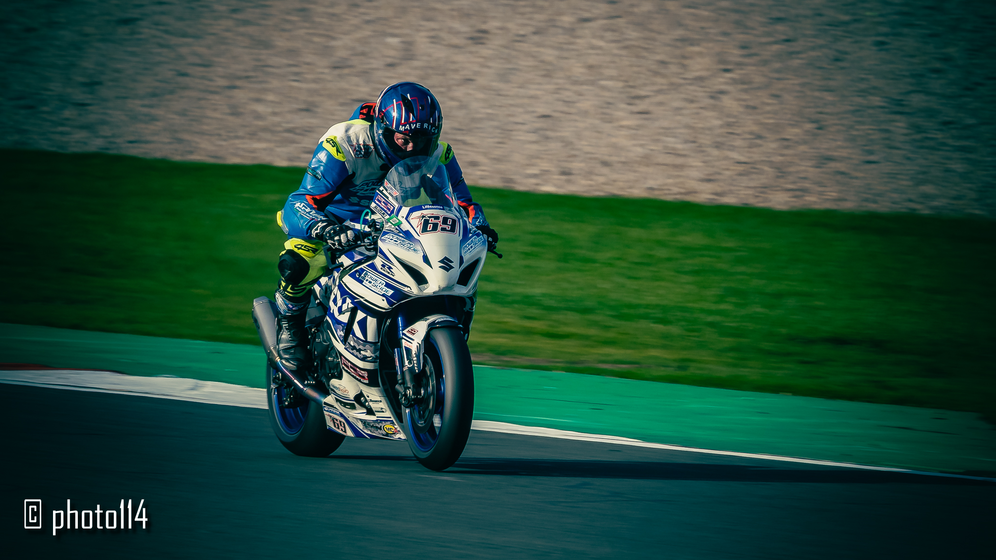
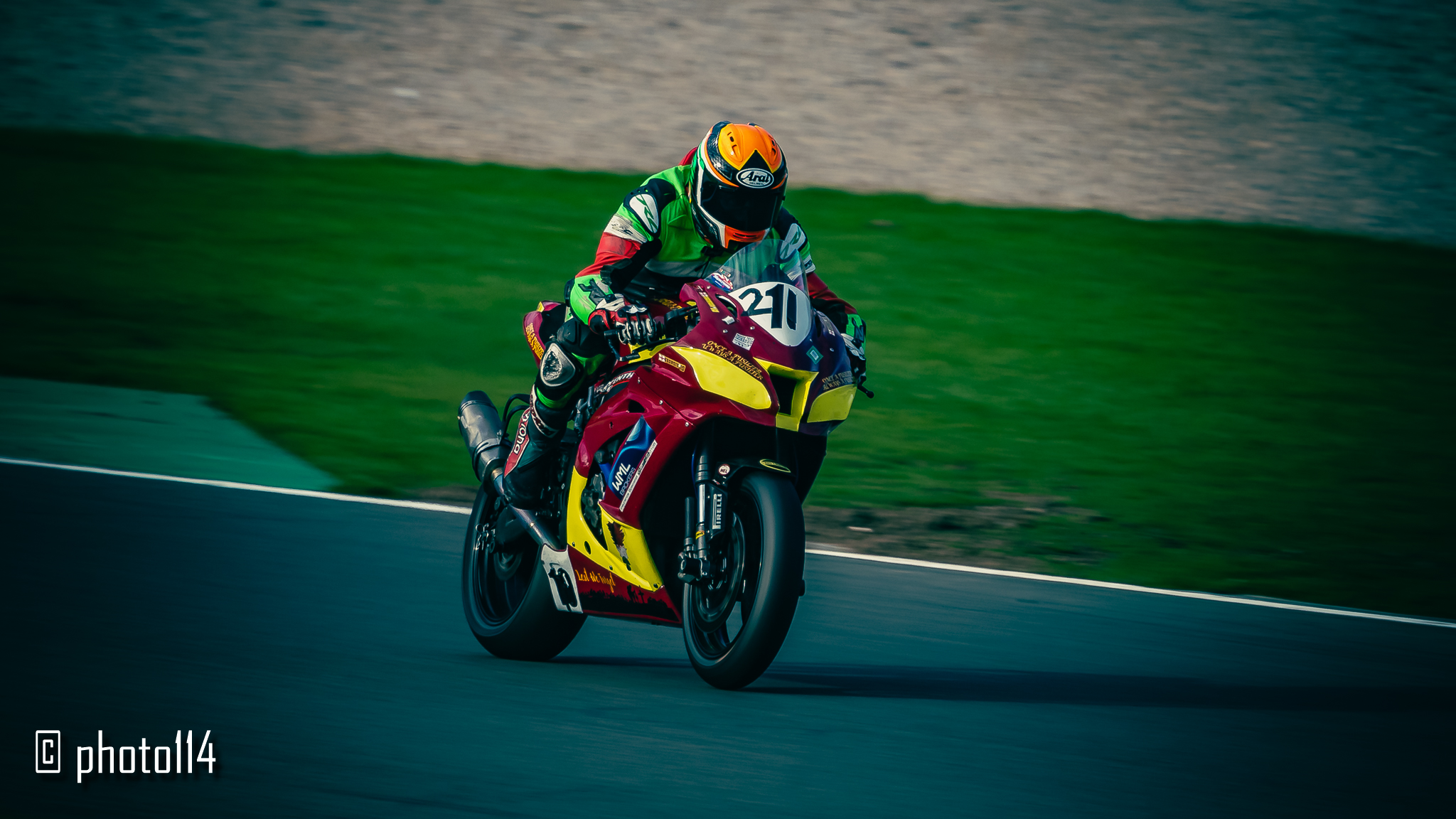
2020 has been a crazy year, hardly any motorsport events to attend, and restrictions placed on spectators limiting the photo opportunities that I might otherwise have enjoyed have resulted in a really bad year for my motorsport photography. One event I did manage to attend this year however was the final round of the 2020 No Limits bike championships at Donington in October.
I’d never been to Donington before so was really looking forward to it, little did I know I’d end up walking 6 miles over the course of the day, which at my age and level of complete un-fitness is not something I’m used to. My legs felt it the next day!
One thing I’ve struggled with, for a long time, is acheiving what I call “critical sharpness” in my images. Probably due to my insistance on blurring the backgrounds with low shutter speed panning shots, I always seem to come away with nice backgrounds but with motion blur in the vehicle I’m trying to capture. Of course panning takes practise, and I’ve had precious little of it this year, but even so I’ve found it a struggle to balance the need to pan with the desire to capture really sharp images.
At Donington I think I might finally have taken a few images I’m proud of, with a selection of them in the gallery attached to this post.
To me, there’s no point taking a picture of a racing car or bike and using such a high shutter speed that it looks like the vehicle is parked on the track. Doing so fails to capture the speed, which is the essense of the experience in my opinion. So I’m never going to crank up the shutter to stupid speeds just for the sake of a sharp image. But I have been experimenting more with the actual speeds I’ve been using, trying to find the right balance, in particular using faster shutter speeds when the vehicle is moving faster, or when it’s not a totally side on shot and it doesn’t actually matter so much if the spokes of the wheel, for example, are totally obliterated.
I’ve also been playing with my editing process, trying to develop some presets of my own to both give my images a consistent look, and also of course to save some time.
With these images I did a number of things I’ve never really done before, such as:-
- Cranking up the clarity and dehaze, to make everything a bit more “shiny”, but reducing the contrast so as not to overdo things.
- Increase the vibrance and saturation to bring out the colours and give the image a bit of “pop”.
- Use colour grading to add some coolness to the shadows and warmth to the highlights.
- Apply a vignette using colour priority which draws in the eye to the subject without being obviously overpowering.
Not sure I’ve quite succeeded in my aims, I will of course continue to experiment, and to learn, but at last, after 3 years of this “hobby”, I feel like I’m getting somewhere!